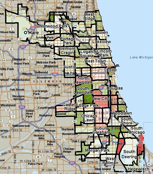
As another follow up to the reported 41.5% increase in Chicago home sales in February I looked at the breakdown by neighborhood since it was apparent that not all neighborhoods were participating equally in the rebound. In the map below, which can be expanded by clicking on it, dark green corresponds to a 300% or greater increase in sales while dark red corresponds to a 50% decrease in sales. I should warn you that for a few of the neighborhoods the number of units are so small that they are almost meaningless.
As you can see the results are all over the map – so to speak. Despite the fact that the bulk of the growth is in the segment below $200K many of the higher end neighborhoods experienced significant growth. For example, Lincoln Park had an 81% increase in sales and the Loop is up 171%.

