Everyone looking to buy a home in Chicago has to come to grips with their commuting options. Along with schools and the cost of the home itself transportation is one of the big 3 factors in deciding where to live. But the impact of transportation is usually assessed in very qualitative terms – and I don’t blame people for this since it’s really not easy to quantify the impact of your location on transportation costs.
Well, I ran across an interesting Web site the other day, created by the Center for Neighborhood Technology, that attempts to quantify the impact of transportation on overall housing affordability. They have created a more holistic affordability index by adding in transportation costs. The result is their H+T Affordability Index, where H+T stands for housing + transportation, and they calculate these costs down to the census block group level. The index is calculated relative to household income – as a percentage of income. Best I can tell they use a common income – for the typical regional household – so that the affordability of each block group is based upon a common yardstick.
For Chicago as a whole they calculate housing costs at 25.2% of income and then transportation adds in another 17%, which is huge. Of course, one has to be cautious of data coming from any organization that has the word “sustainability” in their goals. They probably have an agenda/ bias.
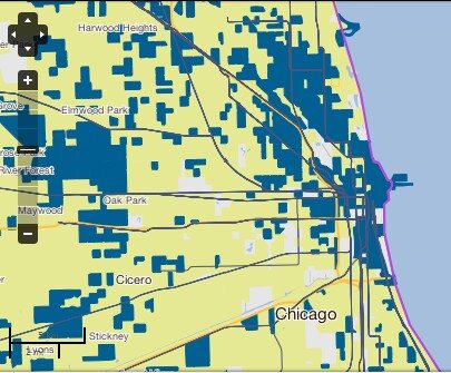
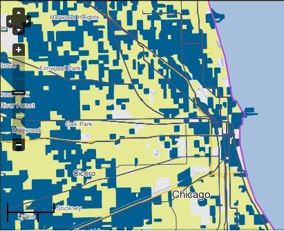
Nevertheless, I found their results interesting and probably directionally correct. They have created side by side heat maps of affordability with and without transportation costs that you can zoom in on. The only problem is that they use a 2 color heat map so you lose much of the perspective on the variations between neighborhoods and they use a different demarcation between the two colors for the two heat maps. However, you can click on a block group to get the details for that particular area.
In order to really see the dramatic differences in the two views of affordability you have to zoom out to a point where you can see the Chicago suburbs. That’s when the transportation costs really come to the forefront as shown in the two maps below. Note that yellow represents a lower index value than blue but for the first map the cutoff is 30% and for the second map the cutoff is 45%.
When you zoom in on the city you find some nooks and crannies where proximity to the central business district provide a bit of a cost advantage. It’s interesting to play with.


