A little over a month ago I posted some data from RealtyTrac that supposedly painted a picture of what is being foreclosed upon in Chicago. The only problem is that the last graph I posted looked rather suspicious since it indicated that almost all of Chicago’s distressed properties were studios. In fact, someone on Cribchatter challenged the legitimacy of that data and it has been haunting me ever since. Finally I realized that with recent changes to the multiple listing service I could actually produce my own analysis, with one important caveat. While RealtyTrac reports on foreclosure activity I can only analyze what is for sale and what has sold. One might expect that in the long run these converge but there is no guarantee.
So, here is a snapshot of foreclosures and short sales in Chicago for the last 30 days. First, there have been 1418 closings in the last 30 days (not a lot). Of those 39.5% were either short sales or bank sales (a lot). However, compare that to the fact that “only” 16.7% of Chicago homes that are on the market are distressed and that tells you that a disproportionate percentage of the homes sold are distressed. In other words, today’s buyers are bargain shopping. No surprise.
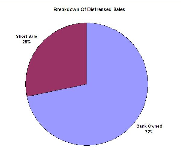
Here is how those distressed sales broke down between short sales and bank sales:
I found the predominance of bank sales a bit surprising. I haven’t dug deep enough to be sure but bank sales are a lot easier than short sales so it could be that buyers and their agents are more willing to pursue them for that reason.
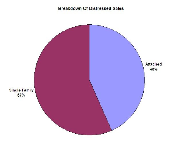
I also broke down the distressed sales in terms of the types of properties:
As you can see there are slightly more distressed single family homes selling than condos and townhomes.
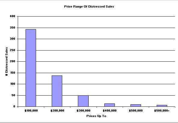
Then I redid the two graphs I copied from RealtyTrac and got a very different result than they did. First, there is the distribution of distressed sales (again, RealtyTrac analyzed foreclosure activity, not sales) by price point:
Compared to the RealtyTrac analysis my data showed more distressed sales at both the low end and the high end. In fact, slightly more than 61% of the distressed sales are below $100,000.
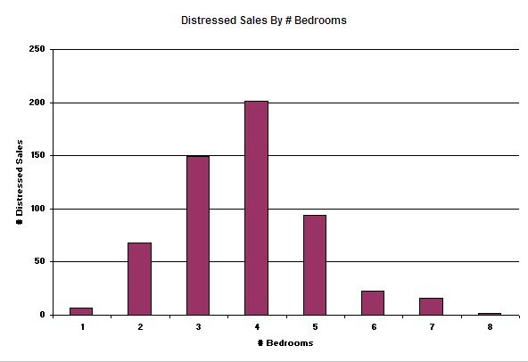
Finally, I redid the graph that caused all the commotion in the first place – the distribution of distressed sales by number of bedrooms:
Sure enough, the RealtyTrac data is probably scrogged up. Distressed sales are distributed pretty broadly across the number of bedrooms, with most distressed properties having 2 – 5 bedrooms.
So, no surprise, people are buying a lot of really crappy (what do you expect in Chicago for less than $100K?), distressed homes with lots of bedrooms.


