About 6 weeks ago Daniel Kay Hertz, an MPP student at the University of Chicago, posted some really interesting visual representations of the spread of poverty and wealth in Chicago: Watch Chicago’s Middle Class Vanish Before Your Eyes. I’ve been sitting on this topic ever since, trying to figure out what to do with it. It’s tricky. Although I really enjoy opening cans of worms I’m not sure I want to with this one. Not to mention that there are some problems with his analysis and even the headline which I have chosen to use, which I outline below. Nevertheless, I think we can all agree that the pattern shown here is pretty much accurate and what I want to focus on is the implications for real estate values throughout Chicago vs. getting all social sciencey on the topic.
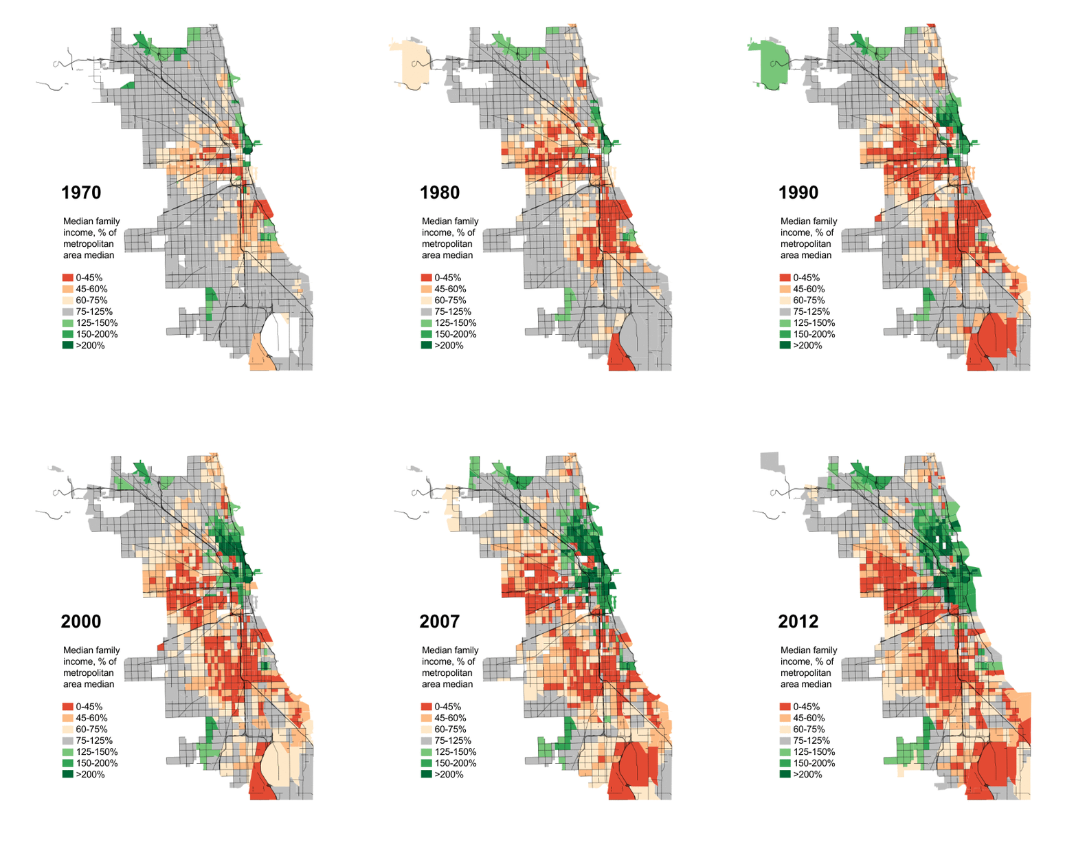
Daniel’s graphic below shows how various areas of the city have transitioned over the last 42 years in terms of median family income. His blog post also has static images of each time period for better side by side comparisons.

This very cool graphic vividly demonstrates what everyone intuitively knows: the north and eastern portions of the city, some near south areas, and a pocket in the southwest corner near Beverly – are becoming wealthier while the rest of the city is becoming poorer. And, since real estate values follow the money, you can expect that those areas of increasing wealth are experiencing, and will continue to experience, above average real estate value appreciation. People with higher incomes want bigger and more expensive homes so land values go up and the value of existing nice homes also go up as the demand for those properties increase. I’ve been seeing this phenomenon first hand in my own neighborhood of East Village over the last two years as land values have gone from $180,000 to $360,000 and single family home prices have risen by similar amounts.
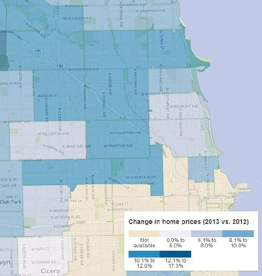
But does the home price data confirm what we would expect? Yes it does. Check out this other nifty little graphic that Crain’s recently put together to show where Chicago home prices are rising the most. Clicking on the image below will take you to a much larger interactive version of this map.
Crain’s created this using zip code level data over the last 12 months from CoreLogic Case-Shiller and it shows home prices rising by 10 – 12% along the Kennedy and the river and in that southwest pocket of the city. Even Uptown is seeing price increases in the mid 11%s. However, in an interesting twist, prices are really rising all over Chicago. Overall prices were up in the last year in every single Chicago zip code tracked by CoreLogic for the first time since 2006. You can see this effect in the Crain’s map but note that the data is simply not available for many of the southern and central zip codes.
So what are the implications for buying real estate? Well, if you want to take a gamble you get in front of the spreading wealth and you are more likely to see above average appreciation if and when the wealth rises in your neighborhood. However, a lot of people got burned that way all across the country right after the housing bubble burst. They became pioneers in areas that looked like they were going to gentrify but never did.
Problems With This Information
As I mentioned in my opening paragraph there are several issues with this analysis and story, some of which are highlighted in the comments section of the original post. First, Daniel is classifying areas based upon census tract household median income relative to metropolitan median household income. But this means that some areas of the city will look worse off simply because their income is rising slower than fast growing areas – even if their income is rising fast enough to keep up with the cost of living. It’s like feeling poorer simply because your neighbor won the lottery. You may feel that way but it’s simply not true.
The other issue is that in my headline I used the term poverty rather loosely to define all the orange areas simply because, grammatically, I couldn’t come up with a better way to write the headline and I thought it got the point across. However, the poverty line depends upon how many people live in a household. A single person can get along fine on $30,000/ year but not a family of four. And 45% of Chicago’s median household income is hardly the poverty line for most Chicago households.
And speaking of this ambiguity in the definition of a household…Daniel’s interpretation of the data also suffers from this problem when he refers to the middle class shrinking. It could be that household incomes are dropping because the households are younger and smaller than they used to be. In that case he would be pushing some of these “middle class” households into red areas.
But like I said in the beginning, I think the general story here is probably correct. You just need to be careful not to draw too many specific conclusions without further analysis.
If you want to keep up to date on the Chicago real estate market, get an insider’s view of the seamy underbelly of the real estate industry, or you just think I’m the next Kurt Vonnegut you can Subscribe to Getting Real by Email. Please be sure to verify your email address when you receive the verification notice.

