Would you attend a speed dating event wearing a tattered T-shirt? OK…so maybe you’re not into speed dating or you look really good in a tattered T-shirt but you get my point. When you only have 15 seconds to make a first impression you want it to be your best. And when home buyers are looking on the Internet at real estate listings you have about 15 seconds to impress them. So, why would you try to sell your home using a real estate agent that takes their own photos when your home can look so much better with professional photos?
It never ceases to amaze me that even the most expensive Chicago properties are often being “marketed” with amateur photos. I’ve seen high end condo buildings where half the listings use amateur photos. At the lower end almost all the photos are amateur and the same with the Chicago suburbs. And some of these photos are so completely awful that I collect them under a special category called Bad Real Estate Photos. Why do home sellers tolerate this? Somebody explain this to me!
A few pictures are worth a thousand words. Check out these before and after photos from one of our old listings. The before photos were actually used in an initial listing of the property and were taken with a decent camera by someone who knew how to take photos but didn’t have all the tools and experience that a professional real estate photographer would have:
- Tripod for use with a slower shutter speed
- Wide angle lens
- High intensity flash
- High resolution camera
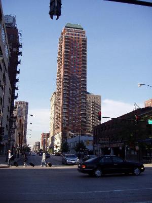
Let’s start with the building exterior. In the original photo below the photographer accurately captured the image but, given the shadows and the distance from the building, all the character is missing.
On the other hand, this photo taken from a lot closer captures the view of what you would see when you walk up to your new home. You can’t see the whole building but you can see the Caribou Coffee and you can see that the building has balconies.
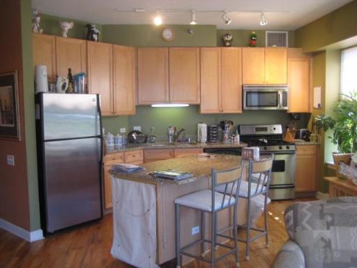
Then there’s these 2 photos of the kitchen. The first one is totally accurate but it’s a bit fuzzy, you can see a lot of clutter on the counter tops, there’s a chair in the foreground, and there’s a white canvas cover over the end of the island.
Compare this photo to the crisp professional shot below sans the chair, the white canvas cover, and the clutter. Notice that with the wider angle lens you also get the view of the hallway and the angle is slightly different to get the island out of the way.
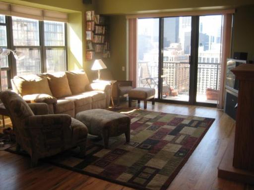
Lastly, the original photo of the living room was way too dark – probably because the light sensor was thrown off by all the light coming in from the windows.
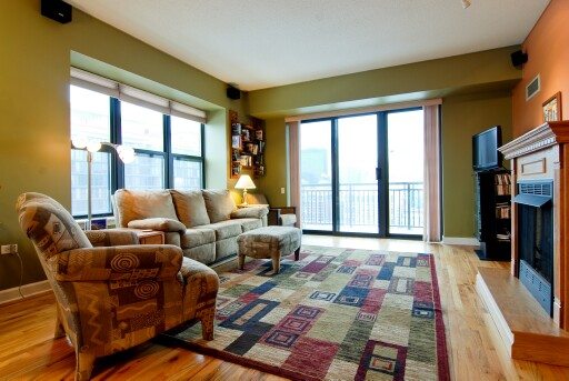
In the professional shot below the lighting is perfect. You can see the texture of the floors and because of a slightly different angle you can now see the fireplace. We also removed one of the ottomans (not ottomen?) so as to open up the floor more. In addition, (you can’t tell from the picture) we removed some of the DVDs from the shelves in the back corner so it wouldn’t look so disheveled.
Of course, just like in real estate, it’s not enough for the photographer to be a card carrying professional. Simply put, not all real estate photographers are created equally. We have our favorite photographer that always gets it right and even provides last minute staging advice. We don’t want to go to battle with inferior weapons so I always insist on using her. I’d mention her name but I don’t want anyone else using her – or maybe it’s a him. Yeah, it’s a him.

