This was originally going to be a quick and easy blog post about how the upper end of the Chicago housing market was on a tear and growing faster than any other segment. But then the data wasn’t exactly cooperating with my preconceived notion and it became clear that there was actually a very different story to be told here. That is the story about how different price points were affected very differently by the bursting of the housing bubble in Chicago.
As I was poking around in the data I noticed a few different patterns and then started experimenting with different segmentations. Ultimately I decided to break the market into below $400K, $400 – $600K, $600K – $1 MM, and $1 MM+ because those break points appeared to be leading to some significant differences in the sales history. I used the 12 month rolling sales sum to eliminate seasonality and, since the sales volumes are pretty different for these 4 segments, I indexed them all to 100 for the 12 months ending January 2008, which was the earliest data readily available to me.
Behold the graph of home sales for the 4 segments below.
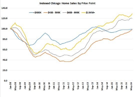
You’ll notice that home sales in the below $400K segment experienced the smallest decline during the financial crisis but I suspect this is because this segment also experienced the bulk of the foreclosures which fueled a real feeding frenzy.
The biggest pullback was experienced in the $400,000 – $599,999 segment which declined by more than 60% at the depths of the crisis and has since fully recovered. However, coming off those depths it has experienced the fastest growth rate of any of the segments and it continues to move higher. This appears to be the sweet spot for Chicago housing right now.
Meanwhile, the upper end brackets – $600K – $1 MM and $1 MM+ – did not suffer as much. They did crash hard early on but then came back a bit. When the rest of the market bottomed in early January 2012 the $1 MM+ bracket was “only” down 40%. But since then both of the upper brackets recovered nicely, actually ending up with sales rates about 20% higher than where they started. However, they appear to be a bit flat in the last year so that party may be over.
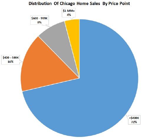
Just to give you an idea of how big each of those segments are I put together the pie chart below based upon the 12 months of sales ending in June. As you can see the segment below $400K is really the bread and butter of the Chicago housing market – almost 3/4 of the total. And that fastest growing segment between $400 – 600K is only 16% of the total.
#ChicagoHousingBubble #HousingBubble
Gary Lucido is the President of Lucid Realty, the Chicago area’s full service discount real estate brokerage. If you want to keep up to date on the Chicago real estate market, get an insider’s view of the seamy underbelly of the real estate industry, or you just think he’s the next Kurt Vonnegut you can Subscribe to Getting Real by Email using the form below. Please be sure to verify your email address when you receive the verification notice.