Last week The American Public Transportation Association (APTA) and the National Association of Realtors published a study that they commissioned on the impact of public transportation on home values. The study is entitled The New Real Estate Mantra: Location Near Public Transportation and it’s thesis is that homes near public transportation fared much better during the bursting of the housing bubble than the average home in the same region. The study looks at five cities including Chicago.
This study was actually prepared by The Center For Neighborhood Technology (CNT), which is the same organization that created the analysis that I featured in a November post on factoring transportation costs into estimates of housing affordability. The concept in that analysis is that the cost of a home isn’t just what you pay for a home but also what it costs you to travel FROM that home over the course of a year.
Not surprisingly what comes out of all of this is that homes near public transportation probably cost more but living in those homes saves you in transportation costs. In fact, I have heard that whatever you save in home prices by moving farther out you will probably end up losing in higher transportation costs. I can’t reference that properly but this is what “they” say. The fact of the matter is that many of my clients will explicitly look for properties that are “close to the el” so I have to believe with that higher demand comes higher prices.
So here are some of the specific findings from the study as it pertains to the seven county area around Chicago. First, living within 1/2 mile of high frequency public transportation (the transit shed) provides access to twice as many jobs per square mile than the region as a whole and living within that radius saves you about $300/ month. Second, according to the study:
The average sales price for residential properties in the Chicago region declined by nearly a third between 2006 and 2011. Prices in the transit shed outperformed the region by 29.7 percent. The CTA shed was the most resilient and did 47.3 percent better than the region; the Metra shed was 22.7 percent better.
These results are summarized in the graph below where the Y axis is the percent change in average residential sales prices relative to the region from 2006-11. Of course, they never really explain what it means to outperform the region by X%. We can only assume that if the region went down by 50% and a particular area declined by 20% then that area outperformed the region by 30%.

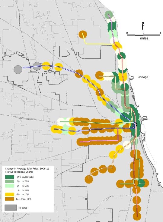
But then they provide a really interesting map of how different locations fared during this period by route. In the map below dark green represents a 75% or greater better performance than the region with yellow being 0 to -50% and brown being below -50%. Well, not only do the green locations pretty much follow the ritzier neighborhoods that we know did really well but the yellow and brown locations follow the poorer neighborhoods that we know didn’t do so well. So how did they adjust for the neighborhood affect and how could you possibly conclude from this that proximity to public transportation helped home values? It obviously didn’t help points south and west. They don’t go into this.
Let’s not forget that organizations like APTA and CNT have an agenda to promote public transportation so we have to take all their findings with a large nugget of salt.
If you want to keep up to date on the Chicago real estate market, get an insider’s view of the seamy underbelly of the real estate industry, or you just think I’m the next Kurt Vonnegut you can Subscribe to Getting Real by Email.