With the Case Shiller home price index for Chicago coming out yesterday it’s a good time to step back and remind ourselves what this thing really tells us. After all, this index essentially looks at home prices in a vacuum – in absolute terms. What can be more insightful is looking at those home prices relative to local incomes. As you might expect incomes should drive home prices or home prices should at least track incomes so that homes remain reasonably affordable.
Zillow produces a quarterly report for 130 metro areas that actually looks at the ratio of median home prices to median incomes, using their home value index as a proxy for home prices. Now I’m not really a fan of Zillow’s home value estimates but because they are looking at an aggregate value in this case I’m willing to cut them some slack.
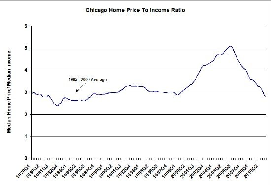
The results of their analysis are rather interesting. The graph below shows the long term trend. From 1985 – 2000 (before the bubble) Chicago’s average ratio was 2.99, which means that the median home cost close to 3 years income for the median household. To put that in perspective, if that median household earned $100,000 per year and lived in a $299,000 home financed at 7% for 30 years with 20% down then their monthly mortgage payment would have been approximately 22% of their income.
As you can see in the chart during the bubble that ratio jumped up above 5, peaking in the second quarter of 2006, which is approximately when the Case Shiller index peaked. If mortgage rates had remained at 7% that median family would have been spending a whopping 36% of their income on their mortgage. Of course, mortgage rates had declined during the bubble (which probably helped feed it) and instead of a 7% mortgage people were probably getting closer to 6%. All in all buying that median price home was still doable.
However, by the first quarter of this year the ratio had dipped down to 2.79 or 6.7% below the historic average. By this measure it would appear that the bubble has fully popped, though in the aftershock of a bubble markets often over-correct.
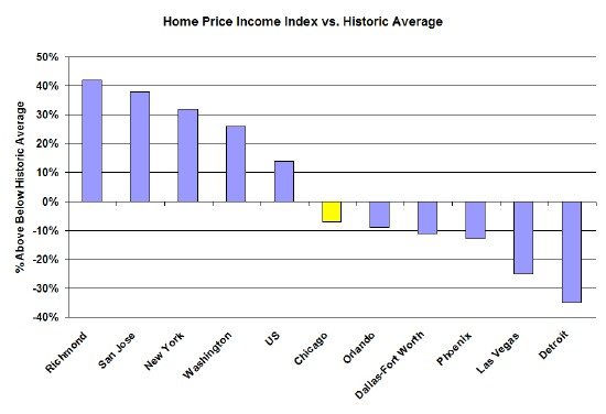
It’s also interesting to look at the data across different markets to get a sense of where different markets might be in their bubble deflation and also get a sense of the relative affordability of those markets. In the graph below I use the Zillow data to compare where several interesting markets are in terms of their correction from the bubble.
For the US as a whole the price to income ratio is about 14% above it’s historic average. Well known bubble markets in Florida, Arizona and Las Vegas have overshot their averages by a significant amount while Detroit has been hit hard by the economic downturn. I threw in Dallas for good measure because I grew up there. At the other end of the spectrum some of the well known high cost markets still appear to be in bubble territory. Richmond is on the list because that’s the last place I lived before returning to Chicago 12 years ago (has it really been that long?) and I was shocked to see how high the relative cost of housing is there.
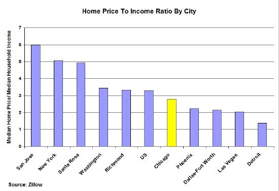
And in the last graph I’m comparing these same markets in terms of affordability. As you can see Chicago falls right in the middle of the pack, on a par with the US average. Markets typically thought of as expensive are just that. One caveat though when trying to use such data to get a sense for affordability…this analysis doesn’t really adjust for the standard of living. For example, looking at this graph you would never know that Chicago is actually a high cost of living city. The reason that it doesn’t look like that in the data is that people in Chicago settle for a lot less than in other cities like Richmond or Dallas. More on that tomorrow.


