The 4 topics listed in the headline don’t actually have that much of a connection to each other but they were all covered in a rather interesting presentation released by the New York Federal Reserve about a month ago: Home Prices, Housing Wealth and Home Equity Extraction. In that report they provided several charts showing the trends in household debt, mortgage standards, homeownership, and home equity.
Total Debt And Composition
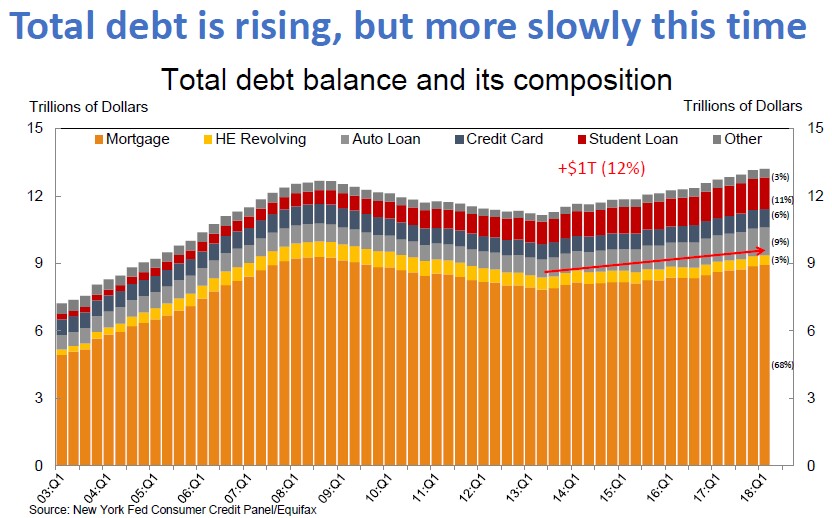
The graph below shows total US private debt over time and it should be clear that aggregate mortgage balances are growing slower than before and also comprise a smaller portion of total debt. What is interesting is that student debt seems to have grown in importance. That’s not a problem as long as all that debt is used to fund job generating education. Unfortunately, I don’t think that’s the case.

Mortgage Standards Have Clearly Tightened
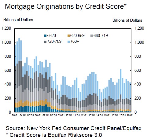
Look at the darker blue and orangeish bars in the graph below. They represent the mortgages from people at the lower end of the credit spectrum – often referred to as sub-prime borrowers. You can easily see that these were much higher than they are now and they started trailing off in 2007. Of course, now that we don’t underwrite as many mortgages to this segment of the population many people are complaining. The banks can’t win.
The Homeownership Rate Is Way Down
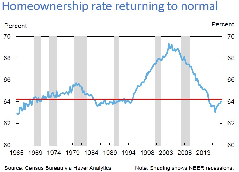
This actually does tie into the previous graph. With tighter lending standards, and the lingering effects of the recession, the homeownership rate is down quite a bit from the peak of the housing bubble. It’s actually back to a more normal level. It peaked around 69% in the 2nd quarter of 2004 and is now around 64%, having risen lately.
Of course, once again, the fact that we are now at a more normal level doesn’t stop some people from complaining about people locked out of “The American Dream”. If you go to the last slide of the presentation you’ll see some not so subtle references about homeownership having not “recovered” (huh?) and housing wealth. Even the Federal Reserve buys into the myth that homeownership is the key to wealth creation.
Median Borrower Equity Over Time By County
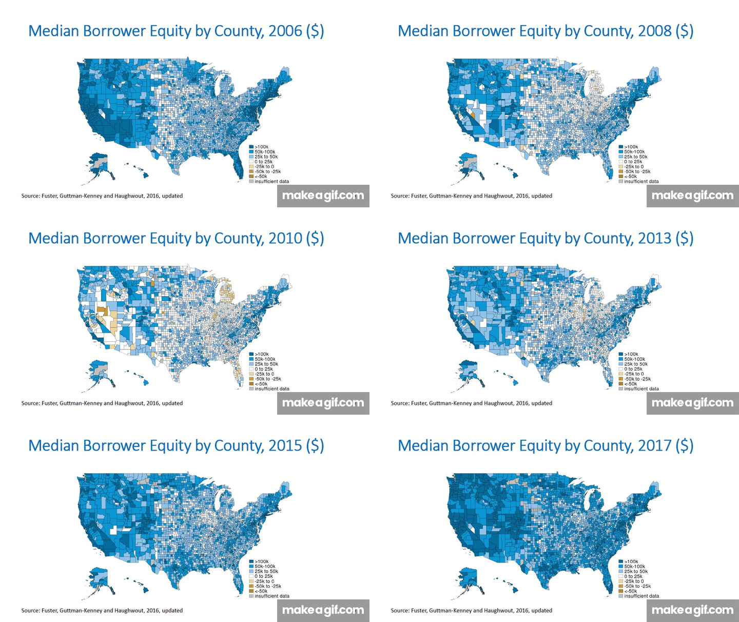
The Federal Reserve also shared a series of slides showing how the country’s home equity has shifted from the peak of the housing bubble until now. I turned those into the animated gif below, which you can click on for a larger version. Dark blue represents the highest median equity while burnt orange actually means seriously underwater. Gray is insufficient data. If you look closely you can tell that it’s all about income and that the center of the country now has substantially more housing wealth than it did in 2006.

Gary Lucido is the President of Lucid Realty, the Chicago area’s full service discount real estate brokerage. If you want to keep up to date on the Chicago real estate market, get an insider’s view of the seamy underbelly of the real estate industry, or you just think he’s the next Kurt Vonnegut you can Subscribe to Getting Real by Email using the form below. Please be sure to verify your email address when you receive the verification notice.


