February home sales in Chicago once again turned in a strong performance relative to last year. For the 20th month in a row closings beat the previous year’s numbers – this time by 19.7%. That’s on top of last year’s 8.6% increase. Although this is one of the lower increases over the last 9 months it’s still a very strong performance.
Now for my usual caveat plus another one this month. The Illinois Association of Realtors comes out with their sales numbers in two weeks and they will report something more like 9.8%. They will be doing two things very differently than me. First, they will be comparing preliminary 2013 numbers to final 2012 numbers. But more importantly they will be comparing their numbers to a 29 day February 2012, though I would expect them to point that out. My number is compared to a 28 day 2012 month so my growth rate is way higher.
February Chicago Home Sales
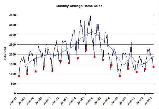
My historic sales graph back to 1997 is shown below, with all the Februaries flagged in red and a 12 month moving average. Notice how 2013 had the strongest February in five years and also note how the moving average line has now reached the short term peak achieved during the height of the government homebuyer tax credit insanity. Looking at the graph it also appears that we are back to February 2000 sales levels – right when prices started to bubble.

Chicago Home Contract Activity
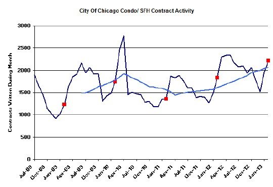
Strong contract activity and the resultant pending home sales continue to signal several more months of blowout closings. As you can see in the graph below February contract activity was the highest in the last 5 years – as long as I’ve been tracking this metric. It was 20.7% higher than last year – the 22nd straight month of increases.
Meanwhile, pending home sales shot up to 5,826 from last month’s 4,994. That’s enough to close 4.2 months worth of sales at the rate closed in February.

Distressed Property Sales
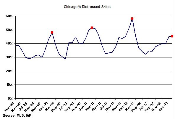
It sure looks to me like we are running out of the dreaded shadow inventory – at least it’s not making its way to the market. February had the lowest percentage of distressed property sales in the 4 years I’ve been compiling this data. It came in at only 45% and February is supposedly the peak time of the year. So it should be downhill from here.

Chicago Home Inventory
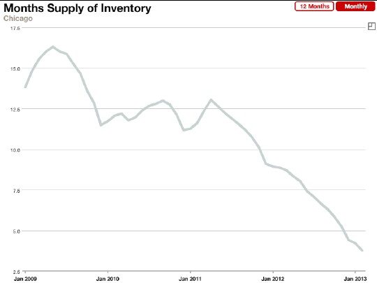
What inventory? The graph below shows the whole story of Chicago home inventory over the last 5 years courtesy of the MLS. From a peak of around 16 months of supply it has now fallen to a measly 3.8 months supply, which is traditionally viewed as a seller’s market, and it keeps on falling. Who would have thought?
A couple of technical points here. First of all the months of supply is calculated based upon the average contracts written over the past 12 months. Second, this graph is a bit misleading. It commits one of the mortal sins of data analysis – the Y axis is truncated at the bottom, which makes the fall off even more dramatic. That axis should start at 0 instead of 2.5.

If you want to keep up to date on the Chicago real estate market, get an insider’s view of the seamy underbelly of the real estate industry, or you just think I’m the next Kurt Vonnegut you can Subscribe to Getting Real by Email.
