This page is a collection of real estate statistics and news for the Chicago real estate market. Data on this page is updated as it becomes available.
Case-Shiller Home Price Index For Chicago Metro Area
Home price data for single family homes and condos in the Chicago metro area is reported monthly and goes back to January 1987. The graph below is current through December 2022 and includes a trendline, conservatively established for single family homes during a 12 year period of rather reasonable price increases.
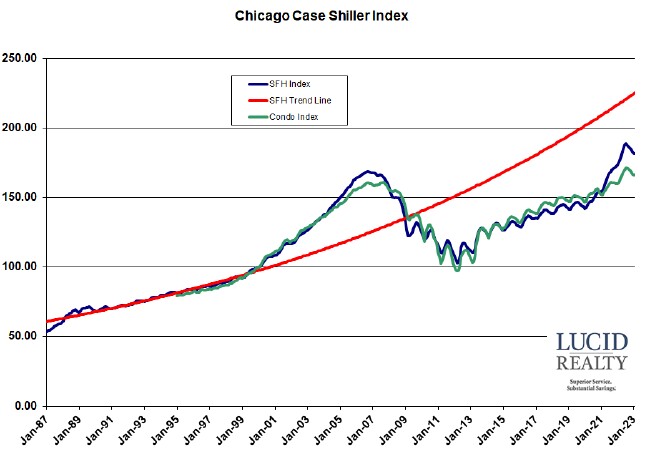
The Chicago real estate market finally surpassed bubble peak prices in August 2021.
The index bottomed in March of 2012 and saw incredible gains in May and June of that year. Prices were up 4.5% and 4.6% from April and May respectively, which is huge. Even after adjusting for seasonality these were the largest one month increases in 24 years. Since then the home prices have made steady gains with the exception of the normal seasonal dips.
December 2022 single family home prices fell 1.2% from November but were up 5.9% from a year ago. Single family home prices have finally exceeded the bubble peak of September 2006 by 8.3%. However, the index is running 18.5% below the trend line.
Condominium prices fell 1.1% from November and have finally exceeded the peak in September 2007 by 3.7%. Condominium prices were 4.4% higher than last year.
Please note that these numbers are based upon a 3 month trailing average of home sales so they are looking back pretty far.
Illinois Association of Realtors Monthly Sales Data (Chicago PMSA)
The IAR tracks monthly units sold for the Chicago Primary Metropolitan Statistical Area (PMSA), which includes a broad area of Chicago and its suburbs. Units sold can be a leading indicator of the direction of housing prices. The graph below shows single family homes plus condominiums sold from January 2006 through December 2022, along with a 12 month moving average (to remove seasonality effects). In addition, we have flagged all December data points for comparison purposes.
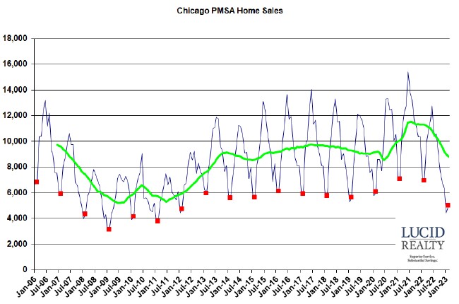
The graph shows that home sales in the Chicago area rebounded nicely from the bottom of the real estate market but then really flattened out for about 6 years. The Coronavirus pandemic had a brief, negative impact on home sales but then lifestyle changes caused home sales to surge, setting new records for the last 15 years or so. However, higher mortgage rates put an end to that run and now home sales are declining dramatically.
Chicago Monthly Home Sales
We have monthly home sales (single family homes plus condos) for the Chicago real estate market back to January 1997, before the housing bubble really started. It is current through November 2022, with all the November points flagged in red for easy comparison. In order to smooth out the seasonal patterns the graph also displays a rolling 12 month moving average of the data.
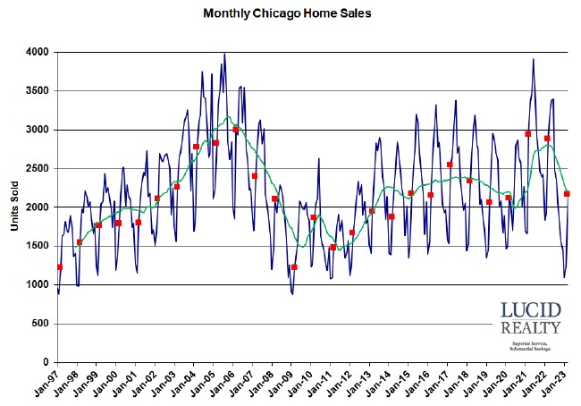
Chicago home sales had been declining for several years but the Coronavirus really tanked the market in May and June of 2020. The market returned to more normal levels starting in July 2020 and was setting new records for a while until mortgage rates started to rise. Now home sales appear to be falling off a cliff.
As you can see the Chicago real estate market activity peaked around 2005 before prices peaked in 2006 and really didn’t start recovering until 2012, which was actually the bottom in Chicago home prices. In other words, sales activity seems to lead price changes by about one year.
Also, if you look at that employment graph below you will see that employment actually continued to improve after the peak in both home prices and sales activity. Now, employment is starting to approach the 2007/ 2008 peak.
Chicago Real Estate Inventory And Days On Market
The sales rate impacts the months supply of inventory on the market and how long properties have been on the market. Ultimately, inventory levels impact home prices. In the graphs below we track the months supply of inventory and the market times of condos and single family homes in the city.
However, there are a few problems with these statistics. A fairly significant number of properties that go under contract don’t close – maybe 20%. So, as the data ages and properties come back on the market, the months of supply numbers change retroactively. Also, the market times shown are only for properties that have sold and not the ones that are sitting on the market forever. Consequently, the market times are really understated vs. the entire population of properties that are on the market.
Home inventories in Chicago had been steadily trending higher until August 2009 when they started to improve. That improving trend continued until January of 2010, when they started to bounce around a bit in the wake of idiotic government interference in the housing market. Since then contract volume started to improve while sellers were holding off so inventory levels improved considerably. Since then inventory levels of both attached and detached homes have been extremely low and got even lower once pandemic behavior set in.
Meanwhile, the market times for homes that have sold have improved dramatically since the housing bubble burst as the inventory has dropped. From peaks of close to 200 days we are now bouncing around under 100 days. For the most part attached homes (condos and townhomes) have sold faster than single family homes until recently when the pandemic resulted in detached homes flying off the shelves.
Chicago Area Employment
A great indicator of long term demand for housing in the Chicago real estate market is the employment statistics. People can’t afford to buy homes if they’re not working. Therefore, we track the employment numbers reported by the Bureau of Labor Statistics for the broad Chicago metropolitan area, which includes such towns as Naperville and Joliet. We track employment instead of the unemployment rate because the latter is strongly affected by estimates of the labor force – and it’s the employed that buy homes. The graph below is current through June 2021 and is uglier than a baboon’s ass as a result of the Covid-19 pandemic fallout. Employment is still recovering from the lows of April but remains at the lower end of the range for the last 15 years.
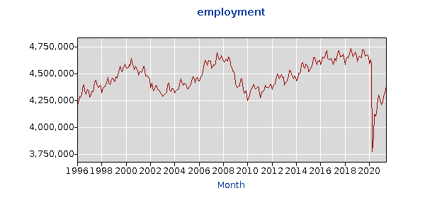
These numbers had been showing growth until June 2008 when employment started to drop from the previous year. After plumbing 14 year lows, Chicago area employment finally rebounded during 2010 and has been on a general upward trend since though the pandemic put an end to that. From the peak in July of 2018 the Chicago area has lost over 343,000 jobs despite some recovery in the labor market.
The unemployment rate for Chicago is a terrible indicator of the health of the local economy but interesting to note nonetheless. The rate can vary significantly from month to month as a result of changes in the assumed size of the labor force. Currently it stands at 8.5%, an uptick from recent months but that is largely the result of an increasing labor force – i.e. people returning to the workforce.
Another interesting tidbit to note is that, even though employment declined from 2000 – 2004, home sales continued to rise. Then, despite the fact that employment rose from 2006 – 2008, home sales were in a decline. So clearly employment is surprisingly not totally correlated with home sales.
Chicago Foreclosures
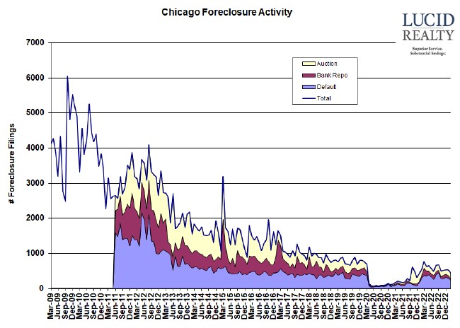
And when people aren’t working foreclosures happen. The following graph, based upon ATTOM data, shows the number of properties experiencing “foreclosure activity” by month – which means that the property owners received some kind of official notice pertaining to foreclosure. However, the aggregate statistics overstate the problem somewhat in that they include all follow up notices – i.e. a distressed property will appear in the numbers multiple times as it passes through various stages of foreclosure. For that reason it’s more instructive to look at the individual components of the activity numbers, since a property is only counted once at each stage. While most of 2012 saw higher foreclosure activity than 2011, activity has trended downward since – in particular the number of homes in default. There was a huge spike in March 2015 – possibly because a logjam was broken up – but the numbers came back to earth in April and have subsequently continued to drift lower and lower. The most recent plunge to near zero is simply the response to the foreclosure moratorium enacted in response to the Covid-19 crisis starting in April 2020. Now that the moratorium has ended foreclosure activity is returning to pre-pandemic levels.
As you can see from the graph the numbers are highly volatile and month to month fluctuations don’t really mean that much.
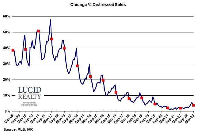
Even more interesting is the percentage of home sales in the Chicago market that are distressed – either bank owned or short sales. The percentages are clearly seasonal, dropping off during the summer when there is plenty of inventory but rising during the winter when the more desperate sellers tend to be out. However, after peaking at ridiculous levels during the housing bubble, the percentage had been coming down until recently. 5.7% of January sales were distressed, which is an increase from last year which benefitted from the foreclosure moratorium.
I’ve opted to produce my own data for these distressed sales rather than use RealtyTrac’s foreclosure sale numbers. I’ve seen too many peculiarities with the RealtyTrac numbers to trust them and at least I know that these numbers come from a reliable source. I think RealtyTrac is grossly underestimating the number of foreclosure sales in Chicago.

