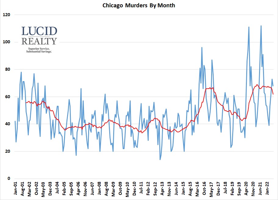
It sure seems that crime in Chicago has been bad ever since the pandemic hit and, understandably, people have reacted most strongly to the number of murders in the city. Well, around this time each year I grab the crime statistics off of Chicago’s crime data portal for the last 12 months ending in June (well, usually in July but I’ve been busy moving) and produce a summary of where the biggest problem areas are in the city and what trends are worth noting. So, let’s see just how bad it has been, starting with a 22 year perspective on the number of murders happening every month.
The graph below includes a red 12 month moving average line to smooth out the seasonality (apparently, murderers enjoy nice weather and hate bad weather just like the rest of us). You can clearly see that murders spiked up right as we went into that initial lockdown and kinda stayed at that level until June when it started trending down a little. Hopefully, that downward trend will continue but, clearly, we’ve seen the highest homicide rate in 22 years, although the first half of 2017 came in pretty close. For the 12 months ending in June there were a total of 787 homicides vs. 791 last year at this time – pretty close. This surge in homicides that correlates with the pandemic is apparently a pattern throughout the country. I won’t speculate as to why.

Chicago Murder Rate By Neighborhood
Sadly, some areas of the city are much more dangerous than others, as you well know, and everyone wants to know which are the best and worst. Therefore, I always roll up the data by neighborhood (technically community area but people often colloquially refer to them as neighborhoods) and then calculate the murder rate per 100,000 people to normalize for population differences. However, as I’ve said in the past, some neighborhoods have way more people in them than the population indicates – e.g. The Loop has a lot of workers there during the day that don’t live there – so their murder rate might be overstated.
The graph below sorts the neighborhoods by their murder rates. 11 of them had no murders in this time period but Bridgeport and Clearing are two of the more notable additions to this list compared to last year when they had significantly more murders. In addition, Hyde Park and Edison Park did not have any murders last year but you can see that they moved much higher up the list this year.
At the other end of the spectrum I’ll first give my annual caveat about Fuller Park: their population is so low that it doesn’t take much to move them a lot on the list. Other than that the two main points to note is that Englewood moved from 2nd worst neighborhood last year to 8th place this year. Wouldn’t it be nice if that trend continued? And then Riverdale moved from 12th place last year to 4th place this year.
My own neighborhood, West Town, remained pretty much the same as last year.
Map Of Chicago Murders
Mapping the murders provides a more nuanced view of where the biggest problems are – or, more appropriately, where the oases are. There is a “safer” pocket southeast of the city and, generally the area north of North Avenue has fewer incidents as well as a strip along Interstate 55. In addition, the community areas just west (not too far west) of 90/94 aren’t too bad until you get to Pershing and then you have another oasis in Hyde Park.
To really get a sense for all this you’ll want to take advantage of the interactive features of this map below. The icon in the upper right corner will blow it up to full screen and you can pan and zoom. Clicking on a balloon will show the key information from the database and you can also click on the colored community area to find out where you are looking.


2 thoughts on “Chicago Murder Map And Neighborhood Totals – 2022 Update”