Obviously a lot of home buyers are obsessed with which neighborhoods have the most potential for home price appreciation. Consequently, I’ve recently written a few posts on which Chicago neighborhoods have been the hottest in terms of price appreciation using a couple of different data sets. However, there is yet another perspective to be gained by looking at which Chicago neighborhoods are seeing/ are likely to see the most gentrification since that is inextricably linked to rising home prices.
Getting a handle on Chicago gentrification is a bit tricky but fortunately The Institute For Housing Studies (IHS) At Depaul spends a lot of energy looking at this topic in terms of displacement pressure, which they measure in terms of rising prices. If you click around on their site you will find all sorts of reports and interactive maps on the subject. Perhaps the best place to start is with the most recent update to their Mapping Displacement Pressure in Chicago project which in turn contains links to other parts of their Web site with additional information.
Let me stop for a minute here to deal with a few elephants in the room. First, IHS clearly did not create this study in order for realtors and home buyers to figure out where the best investments are. In fact, using their tools in this way actually exacerbates the very problem that they are trying to solve. However, when making the biggest investment decision in your life you owe it to yourself to use all available data and this is interesting data.
Second, displacement is not the goal of gentrification though some people on both sides of the issue may see it that way. Rather it is an unfortunate consequence of rising prices. Another way of putting it is that I don’t think displacement leads to rising prices but rising prices certainly lead to displacement. And it’s the rising prices that, in fact, the IHS is looking at in their analysis and that’s what we are interested in.
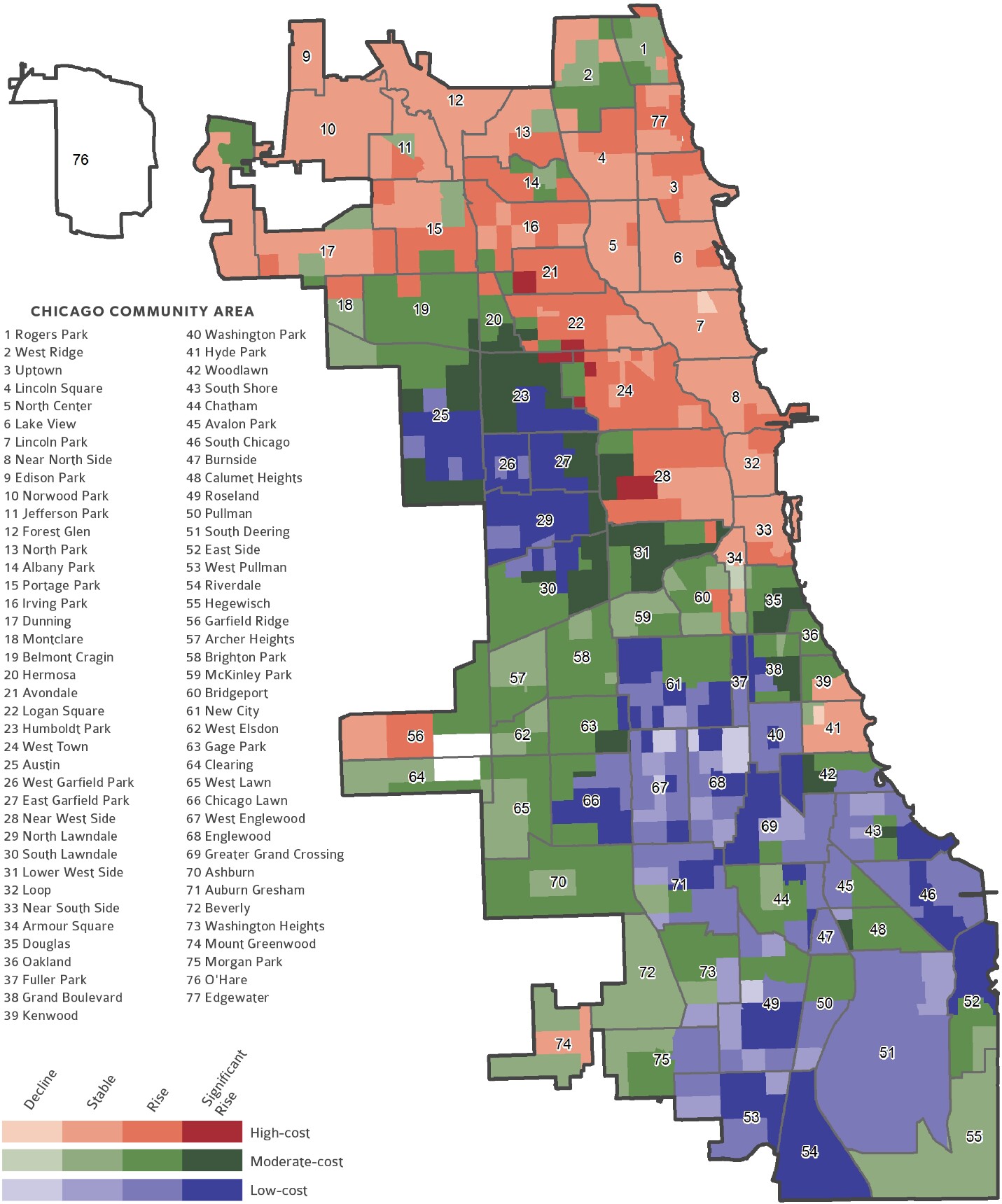
They summarize their results in this really cool map in their report, which looks at 790 census tracts across Chicago and ranks them based upon the cost of housing and the increase in sales prices from 2012 to 2017. Red areas are the highest cost, blue the lowest, and green in between. The darker the color the higher the increase in sales prices over this period. So this map gives you a quick idea of where are the most affordable areas with the highest price appreciation. (Of course, as they say in the mutual fund industry “past performance is no indication of future performance”.)
You can click on the map for a larger version and click the resulting map for an even larger version.
The picture that emerges above is fairly similar to the pictures I’ve shown in other posts about Chicago’s hottest neighborhoods. Basically there are pockets away from city center – mostly west and south – that are seeing the greatest price appreciation.
#ChicagoHomePrices #Gentrification
Gary Lucido is the President of Lucid Realty, the Chicago area’s full service real estate brokerage that offers home buyer rebates and discount commissions. If you want to keep up to date on the Chicago real estate market, get an insider’s view of the seamy underbelly of the real estate industry, or you just think he’s the next Kurt Vonnegut you can Subscribe to Getting Real by Email using the form below. Please be sure to verify your email address when you receive the verification notice.
