Although I rarely write about the Chicago area employment picture I do maintain that data as part of my Chicago real estate market statistics page. As I was updating it recently I realized that it’s worth taking a step back and reviewing where we’ve been and how it is really helping the Chicago area real estate market. Let’s face it…people need to have jobs in order to afford homes and the more people that can afford homes the better the real estate market does.
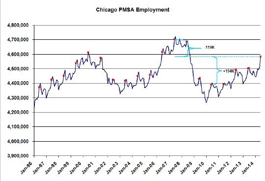
When it comes to how many people can afford homes it’s not the unemployment rate that matters but rather the absolute number of people that actually have jobs, which is what the graph below shows – the total employment level for the entire Chicago PMSA (primary metropolitan statistical area that basically includes the 9 county area) from January 1996 through June 2014. Also, as I’m accustomed to doing with highly seasonal data like this, I flagged all the June data points so that we can compare previous years’ values.

Chicago area employment actually peaked in July 2007 but June was pretty close to the peak with 4.7 MM jobs. Over the next year employment drifted down a bit and then fell off a cliff. It finally bottomed in 2010, with the June number coming in at 4.389 MM and it has been recovering steadily ever since. This June showed a total gain from the bottom of 194,000 jobs, which is a considerable recovery, but it’s still 119,000 jobs shy of the peak. Nevertheless, as you can see, June had the highest employment level in the last 6 years and it ranks 5th in the last 19 years.
With a jobs picture this strong how can the housing market not power higher?
If you want to keep up to date on the Chicago real estate market, get an insider’s view of the seamy underbelly of the real estate industry, or you just think I’m the next Kurt Vonnegut you can Subscribe to Getting Real by Email:
Please be sure to verify your email address when you receive the verification notice.
