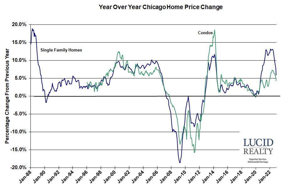
With this morning’s release of the December Dow Jones S&P CoreLogic Case Shiller home price indices for 20 metro areas, including the Chicago area, it’s clear that home prices continue to decline across the nation. More on that in a bit but in the meantime let’s look at where we are on a year over year basis because that data still shows a significant gain due to the extraordinary gains from early last year. For instance, the 10 and 20 city composite indices were up by 4.4% and 4.6% respectively while the national average was up by a more impressive 5.8%. The Chicago metro area is still up 5.9% for the 12 months ending in December but to put that in perspective just look at the graph below. That’s the lowest annual appreciation rate in just a bit more than 2 years.
In terms of the Chicago area’s ranking among the 20 metro areas it fell slightly from last month to 8th place from 7th place.
Oh…and condos are slowing down also with a mere 4.4% year over year gain in the last year but that’s still higher than the annual appreciation rate 13 months ago.

Craig J. Lazzara, Managing Director at S&P DJI, remains fairly pessimistic about where this is all heading:
The prospect of stable, or higher, interest rates means that mortgage financing remains a headwind for home prices, while economic weakness, including the possibility of a recession, may also constrain potential buyers. Given these prospects for a challenging macroeconomic environment, home prices may well continue to weaken.
Case Shiller Chicago Area Home Price Index By Month
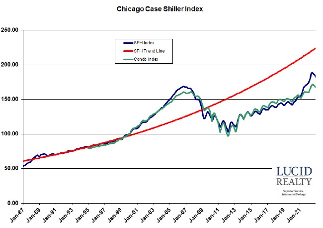
The graph below shows the actual Case Shiller Chicago area index values for single family homes and condos going back to 1987 along with a red trend line that I developed based on pre-bubble data for single family homes. The single family index fell 1.2% from November while the condo index fell 1.1% but, given the normal seasonality that is evident in the graph, it’s really hard to say if that’s an extraordinary decline. For single family homes that amounts to 5 consecutive months of decline – 3.3% in total – from the recent peak, which is definitely up there but, looking at the graph, we’re still way ahead of where we would have been had we continued along the recent trajectory.
Speaking of which…single family homes had started to close that growing gap with the trend line but now the gap is growing again. We currently fall short by 18.5% but we are still 8.3% above the bubble peak and 77.7% above the lowest point of the crash. Condos are now a mere 3.7% above the peak but still a whopping 71.7% above their lowest point.


