There seems to be no shortage of home price data out there since everyone is acutely interested in where home values are going. The only problem is that almost all of this data is misleading at best and totally worthless or wrong at its worst.
Case in point: the Chicago Tribune’s median home price heat map, which was just updated a couple of days ago with data from the 3rd quarter. On the surface it sounds like a really cool idea – drill down access to county, city, and Chicago community area data. The only problem is that this data is largely meaningless, misleading, and incorrect.
Problem #1: What good is median home price data?
I’ve mentioned this numerous times before. Most people looking at this data are expecting to see some indication of where home prices are headed. But median price data doesn’t tell you that. All it tells you is what is the median price of homes sold in a given period, which very much depends upon the mix of homes sold. So if suddenly more single family homes are sold relative to condos then median prices will rise even though there may be no change in underlying home prices. In fact, all I look at median home price data for is to get a sense of what is going on with the mix of sales.
If you really want to know what is going on with home prices you need to look at data from Fiserv or Case Shiller that looks at consecutive sales of the same homes. The only problem with this data is that it is rarely available at the community area or zip code level.
Problem #2: The data is wrong/ misleading
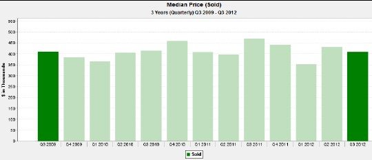
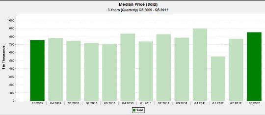
I was poking around on the Tribune site and I drilled down to the map of Chicago. Within that map it shows North Center median prices up 24% in the last 3 years. I was intrigued because that seemed to be news to me. So I ran quarterly median prices for the last 3 years for all homes, single family homes and condos in North Center. On a combined basis the median home price in the 3rd quarter of 2012 was essentially the same as it was in 2009. I don’t know where they get a 24% increase from.
More importantly, though, you can’t boil 3 years of fairly granular data (e.g. at the community area level) down to a single number like +24%. There’s a lot more nuance to it. For example, here is what the median home price data for North Center really looks like (including both single family homes and condos):
Given the amount of volatility in the median home price data from one quarter to the next over the course of the last 3 years I don’t really think that one can draw any conclusions about a clear change over that time period. Even looking at just single family median home prices pretty much still leaves you in the dark – too much quarter to quarter variation, though 3 of the last 4 quarters were higher than the 3rd quarter of 2009.
So trying to interpret this data on the Web is kind of like trying to diagnose illnesses based upon Wikipedia entries. You can easily draw the wrong conclusions.

