In a few hours the Case Shiller home price index for February will be released and it will almost certainly show further significant price declines. I’m saying this because a) I don’t see how prices could have gone up and b) CoreLogic released their February home price data for the Chicago area a while ago and it showed further declines. Using a methodology that is similar to that used by Case Shiller (looking at repeat home sales so that you get an apples and apples comparison) CoreLogic often reveals more detailed information, though they only show price changes and not the underlying index values. In the past the CoreLogic numbers have been fairly consistent with the Case Shiller numbers.
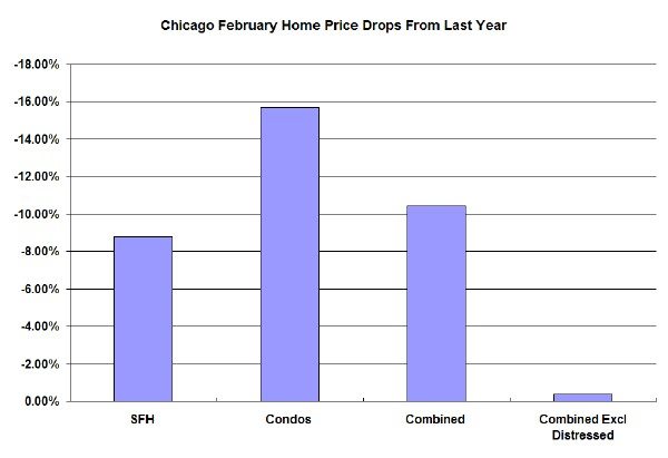
The February data shows that single family home prices were down 8.8% in the last year, while condo prices were down 15.7%. What’s really interesting though is the impact that distressed properties are having on the market. Apparently, when CoreLogic combines all property types prices have dropped 10.4% in the last year. However, when you exclude distressed properties (which are running about 50% of all sales right now) the price decline is much lower – only 0.4%. We knew that distressed properties were dragging the market down but that’s a huge difference! Here is a graph for that data:
Frankly, I don’t believe what this graph suggests – that all price declines are in the distressed properties. I’ve seen too many cases of “normal” homes dragged down by short sales and foreclosures. But the data is what it is.
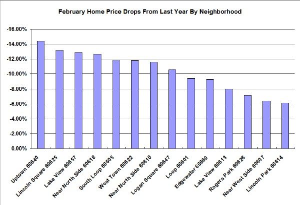
CoreLogic also recently made more detailed neighborhood home price data available to the Chicago Tribune, which created a cool graphic that allows you to see February home price changes by zip code. I’ve summarized some of this home price data in the graph below. Keep in mind that zip codes don’t correspond exactly to the well known neighborhoods but I attempted to assign them the best I could:
Some of these are no surprise – like Uptown at the head of the pack with a 14.4% home price decline in the last year. But I certainly didn’t expect the southern part of Lake View to be at the top of the list while the northern part is at the bottom of the list. And there is no surprise that Lincoln Park is at the bottom of the list but what is the Near North Side doing so high on the list? And why isn’t Rogers Park higher up?
Anyway, it’s nice to have information like this since Case Shiller doesn’t report it at this level of detail. We’ll get Case Shiller’s take on things in a little more than 8 hours.


