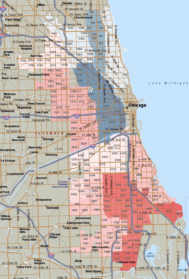
About a week ago I looked at where the Chicago housing market was still dead based upon where there was still a significant volume of distressed properties on the market. Since then the DePaul Institute for housing studies has come out with their second quarter Cook County house price index and they’ve broken down the price trends by area, which allows us to take a different look at what parts of the Chicago housing market are dead and what parts are hot. In addition to 17 suburban groupings they broke Chicago down into 16 areas. The result (no surprise) shows that the change in Chicago home prices over the last 15 years have varied dramatically by area.
Unfortunately, the analysis is not as granular as we’d like it to be. Their groupings often lump together community areas that are very different so the resultant averaging can be somewhat muddled and for some reason they left out central areas like Near North Side, The Loop, and Near South Side. However, they have provided both the raw data and some nice interactive displays that allow you to pick individual areas and see how home prices have changed over time in that area. One thing that becomes immediately apparent is that claims of housing bubble 2.0 are greatly exaggerated. No area is above the peak and most areas are substantially below peak.
I found the data on price changes from 2000 to be the most interesting since 2000 was just around when the housing bubble started and 15 years is a great time period for getting a sense of the long term trends. I attempted to place the data in the heat map below (it was way too painful and not at all worth it) where the dark red areas represent a loss of 5.2% and the dark blue represents a gain of 127%. That’s a huge difference and just imagine losing value over a 15 year period!
If you click on that map you will see a larger version, which you can click on again for a full size version.

As always, the south side and the far west have not fared well. The areas that have done the best are near west and near northwest – Lincoln Square, North Center, Logan Square, West Town, etc… I would imagine the reason is that these areas were perceived as highly desirable and were still relatively affordable so they experienced a surge of gentrification/ redevelopment.
DePaul’s Home Price Index Methodology
The nice thing about DePaul’s home price index analysis is that it breaks Chicago down into submarkets, which we don’t typically see with the Case Shiller home price index. As I understand it, in order to work off of a necessarily smaller sample size in submarkets they use a statistical model that allows them to normalize the sales prices of different homes based upon size, age, number of bedrooms, number of bathrooms, etc…
#ChicagoHomePrices
Gary Lucido is the President of Lucid Realty, the Chicago area’s full service discount real estate brokerage. If you want to keep up to date on the Chicago real estate market, get an insider’s view of the seamy underbelly of the real estate industry, or you just think he’s the next Kurt Vonnegut you can Subscribe to Getting Real by Email. Please be sure to verify your email address when you receive the verification notice.
