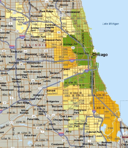
It should probably come as no surprise that the housing bubble did not affect all Chicago neighborhoods equally. It’s fairly common knowledge that the more tony neighborhoods like Lincoln Park made it through the Chicago housing bubble relatively unscathed (once all the dust settled) while south and west side neighborhoods got creamed. But just how big was the difference?
Well, Depaul University’s Institute for Housing Studies just released their 4th quarter report on the Cook County house price index and it breaks down single family home/ condominium price trends by neighborhood – actually they create small submarkets that are collections of a few neighborhoods. All the data is normalized to the first quarter of 2000, which is right around the beginning of the housing bubble – i.e. all submarkets are set to an index value of 100. Comparing that point in time to the fourth quarter of 2012 gives us an idea of the net impact of the housing bubble on each neighborhood. For instance the best performing neighborhoods were the Chicago Loop and its adjacent neighborhoods and West Town/ Logan Square and some of their adjacent neighborhoods. These submarkets rose 36% and 34.8% respectively. In contrast, the neighborhoods around Chatham/ Woodlawn/ South Shore and South Chicago/ Hegewisch fell 45.9% and 44.5% respectively.
I plotted these price changes in the heat map below where dark green corresponds to the largest increases in prices and dark yellow/ gold corresponds to the largest decreases in prices. As you can clearly see the central area along the lake performed the best all the way up through Rogers Park and Edgewater while the western and southern areas performed the worst. The dichotomy between the extremes is startling.
In looking at the data closer one of the things I noticed is that some of the neighborhoods that did pretty well over the last 12 years didn’t run up quite as much as the other neighborhoods. Lincoln Park/Lakeview for instance had the lowest peak value of all the submarkets tracked and the Loop and its adjacent neighborhoods was at the lower end of the peak range.
The nice thing about the Institute for Housing Studies’ data is that their price indices are developed in much the same way as the Case Shiller price index is done – they both use consecutive sales of the same property. However, mysteriously the Institute’s numbers end up telling a very different story than Case Shiller does when it comes to condominium prices – see the graph below. While their single family home price indices are reasonably close their condo price indices are very different – and IHS’ condo indices are very different than their single family home price indices. I wouldn’t expect that so I do call the quality of their data into question.
Nevertheless, you would expect that whatever error they have going on would affect all neighborhoods equally??? And the IHS numbers are the only home price indices we get at the Chicago neighborhood level.

If you want to keep up to date on the Chicago real estate market, get an insider’s view of the seamy underbelly of the real estate industry, or you just think I’m the next Kurt Vonnegut you can Subscribe to Getting Real by Email.

