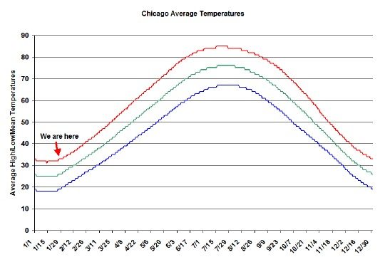
I hate cold weather. I grew up in Dallas before my family could afford much air conditioning and before sun screen and ubiquitous water bottles. You would think I would know better than to live in Chicago. I’m also a numbers kinda guy. So a long time ago I created this handy little graph of the average high, low, and average temperatures for Chicago by day so that I can track where we are in the temperature cycle. It helps me make it through the winter. I’ll let you figure out which of the 3 lines is which in the temperature graph below.
Yesterday was a key date along the curve because, statistically, it’s the first day of rising temperatures in Chicago during the year. Remember though that this is just on average. In reality there is a huge amount variation around this data. The fact that we are just now breaking out of a cold spell is purely coincidental, but nice nonetheless.


