On Tuesday I posted the monthly update of the Case Shiller home price index from S&P Dow Jones CoreLogic which showed a dramatic rise in Chicago area home prices during the last year. Unfortunately, that index only tells us how home prices are doing across the entire metro area when, in reality, home prices could be rising at dramatically different rates within different neighborhoods.
Fortunately, the Institute for Housing Studies at DePaul University produces a quarterly home price index analysis of 33 sub markets of Cook County, including 16 within the city of Chicago. They use a methodology that is similar to what the Case Shiller index is based upon. Two weeks ago they released their 2nd quarter 2020 report, which is not as current as the Case Shiller index but it still gives us a pretty good idea of which Chicago neighborhoods are the hottest right now. As you might expect there really are dramatic differences by neighborhood.
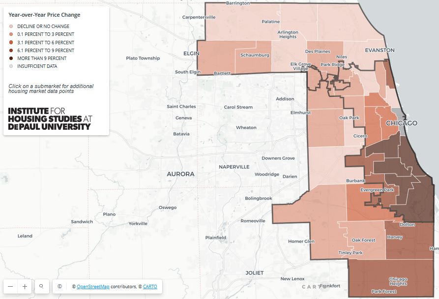
Their heat map of the county provides a pretty good quick overview of what is going on and it shows all the action on the south side for a change. In fact, the higher income areas on the north side, such as Lake View and Lincoln Park, are actually showing price declines over the last year.

They also provide this interactive graph of the price trends for each of the sub markets from January 2000 – June 2020. Rolling over a line reveals which neighborhood it corresponds to and what the gain has been since January 2000. You can pick points anywhere along the line and get the appreciation through that point in time. Although the graph starts in January 2000 you can download a spreadsheet with data going back to the first quarter of 1997.
Here are a few of the highlights from their report:
- The top two areas in cumulative gains remain West Town/ Near West Side, with 188.9% appreciation, and Logan Square/ Avondale with 172.8% appreciation
- The worst performers in the city over the entire period were Auburn Gresham/ Chatham, up only 42.1%, and South Chicago/ West Pullman, up 43.0%.
- However, those depressed areas are now bouncing back. Over the last year South Chicago/ West Pullman took the top spot with 13.4% appreciation and Bronzeville/ Hyde Park came in second with 12.3% appreciation. Auburn Gresham/ Chatham produced a 9.7% gain.
- As I mentioned earlier, Lake View and Lincoln Park actually lost ground in the last year – down 2.9%
- Only 5 sub markets in the city are above their bubble peak and a few of those are barely above it. West Town/ Near West Side has gained the most, up 23.2%, and Logan Square/ Avondale came in second place with a 19.4% gain. Neither of those are that impressive over roughly a 13 year period.
- From the bubble peak Englewood/Greater Grand Crossing has done the worst. It’s still down 38.9% and second place South Chicago/West Pullman is down 28.5%. But, again, those areas are now bouncing back strongly.
- The strongest recovery from the bottom was in Humboldt Park/ Garfield Park which bounced back 174.9%. Nobody else came close to such a dramatic recovery. Bridgeport/Brighton Park had the second largest recovery with a 96.6% increase.
- Some areas have just been more stable over time and therefore don’t have as much to gain back. For instance, Lake View/ Lincoln Park only rose 73.8% during the housing bubble, compared to a 192.5% gain in Humboldt Park/ Garfield Park. But then Lake View/ Lincoln Park dropped only 12% from the peak and has since bounced off that bottom by only 16.1%
#ChicagoHomePrices #ChicagoRealEstate #NeighborhoodNews
Gary Lucido is the President of Lucid Realty, the Chicago area’s full service real estate brokerage that offers home buyer rebates and discount commissions. If you want to keep up to date on the Chicago real estate market or get an insider’s view of the seamy underbelly of the real estate industry you can Subscribe to Getting Real by Email using the form below. Please be sure to verify your email address when you receive the verification notice.
