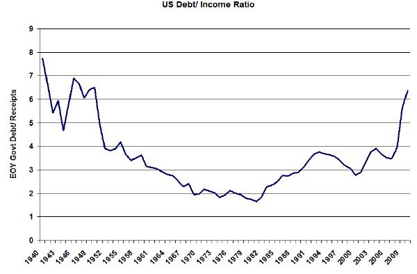
We’ve all heard about how bad our nation’s deficit is but just how bad is it really? As I was catching up on my investment reading and re-evaluating my strategy I started to wonder what the country’s debt situation really looked like. I mean…maybe I need to move to Costa Rica. You can find a lot of charts out there on our deficit as a percentage of our GDP or our debt as a percentage of our GDP but what I really wanted to know is how does our government’s debt compare to how much money they take in each year. Personally I think that’s a measure that we can all relate to.
Well, it turns out that I couldn’t find that particular chart out there so I had to create my own. And lo and behold it ain’t a pretty picture.
That chart goes through the end of 2010, for which year it’s still an estimate. First of all, notice how it has been rising pretty steadily since the early 80s. Second, notice how fast it’s rising now. Third, notice how high it is right now. If you made $100K/year would you be comfortable owing $600K and rapidly taking on more debt each year? I hope not, otherwise the government will be bailing you out soon – but I digress. And if you were loaning money to this clown at what point would you cut them off – or at least charge more interest?
OK. So it’s been that high before. But that was during a war and we eventually grew our way out of that one (did they raise the hell out of taxes too?). So what’s likely to happen this time? I think we can count on higher taxes to some extent but I won’t bet on lower government spending. I also think it’s pretty clear that interest rates are going up – including mortgage rates. We’re exporting inflation to China and at some point they say enough is enough.
So where does that leave us? San Jose is going to have a high of 80 today. Other than moving there I think it’s time to short more treasuries or buy a house.

