After recently reporting on the 41.5% increase in Chicago home sales the natural question that a lot of people are asking is “Where is this because I’m sure not seeing it?”
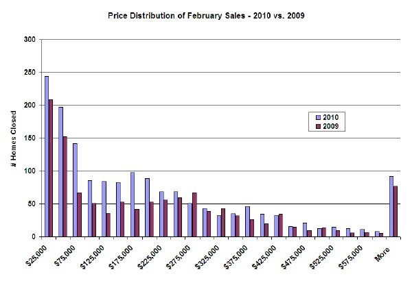
So I looked into it. The first thing I checked was Chicago home sales in different price ranges and, as many expected, it shows that all the increase in sales is at the low end.

As the graph shows, almost all the growth in Chicago home sales is occurring below $250K, with another small increase from $350K – 400K. Of course, the big shocker for me is always how much activity occurs below $100K. Much of that stuff is pretty scary.

Unless I’m reading your chart wrong, Gary, there are substantial percentage increases in volume at most of your higher price points.
The absolute transaction volume is higher at the lower end, but the percentage increases appear to be larger at the higher end. No?
Good point, Joe. Some of the “buckets” I created at the higher price points in fact did see some huge percentage increases but others didn’t and the same is true at the lower end of the spectrum. But it’s all over the map and there are some pretty small buckets in there so to smooth it out let’s look at 200K and below and then above 200K. Below 200K it’s up by 54% but above 200K it’s only up 16%.
Those buckets aren’t terribly relevant to north and near south lakefront Chicago buyers.
Three or 4 buckets might be more useful. Thanks for the effort in any event.