Yesterday I provided some Zillow data that showed how Chicago home prices have tracked with income over time and how home prices relative to income compare across cities. However, as I mentioned, most of the data you see comparing home prices across cities does not adjust for the quality of housing. When I see Chicago showing up with housing costs similar to Dallas and Richmond I know something is seriously wrong with the data – by a factor of 2 or 3.
So what is the real story? Well, Coldwell Banker puts out an annual home price comparison index and something interesting happened to it over the last couple of years. When they produced the home price comparison for 2009 they described their methodology as follows:
The criteria for the HPCI subject home is: single-family dwelling, 2,200 square feet (approximately) four bedrooms, two and one-half baths, family room (or equivalent) and two-car garage in neighborhoods/zip codes within a market that is typical for corporate middle-management transferees.
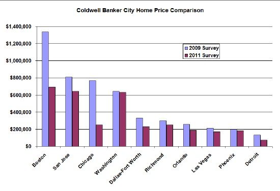
On the other hand when they did their 2011 survey they did not mention anything about the types of neighborhoods or the size of the house. Instead they described it as “a snapshot survey of average listing prices for four-bedroom, two full bathroom homes.” I can assure you that the bulk of those homes are in neighborhoods that are not typical for corporate managers. In fact, look at the difference in results for the two surveys:

I think the 2009 survey is much more meaningful. I wonder why they changed their methodology. But the bottom line is that you shouldn’t kid yourself. We get a lot less for our money in Chicago than elsewhere. The home that costs $300,000 in Dallas or Richmond costs a whopping $768,000 in Chicago – and I don’t think your salary is going to reflect that difference. Think about that carefully next time you consider where you want to settle long term.
