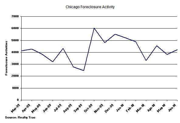
This started out as a post about the 11% increase in June foreclosure activity in Chicago but I quickly decided that there was a much more interesting story here. The fact of the matter is that this RealtyTrac foreclosure data is so volatile that you would expect there to be a bit of fluctuation from month to month. An 11% change doesn’t mean much. Just look at the historic data:
If anything, it looks to me like the foreclosure activity is on a downward trend since that big bump in October. Yawn….
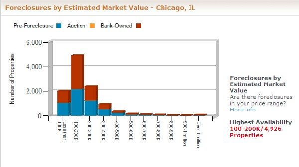
What’s more interesting are some of the other charts that RealtyTrac has on their site. For instance, the chart below shows the distribution of foreclosures by market value.
It confirms what we all knew – most of the foreclosures are at the low
end – mostly below $200,000 to be more exact.
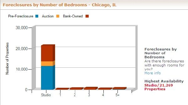
What’s even more interesting is that almost all of these are studios.
That’s something I just didn’t expect. I thought most of those low end
properties were junky single family homes.
To see these charts yourself you’ll need to register on the Realty Trac
site. It’s free.


