In one of my recent blog posts about Chicago crime someone asked me if I had looked at the data in relation to home prices. I think we all know intuitively what the answer is but I decided to actually do a quantitative analysis to see if any neighborhoods stuck out in terms of being too expensive or really cheap for the crime rate. I used the assault and battery data that I recently pulled for my analysis of Chicago’s most dangerous neighborhoods for assault and battery.
I should explain that up until now I have been using the term neighborhood loosely. In fact, the way I really did the analysis was by community area. If you don’t understand the difference between a neighborhood and a community area then you probably need to read my blog post on this topic: Defining Chicago’s Neighborhoods.
I aggregated the number of assault and battery incidents by community area and then divided those by the 2010 population of each area (from that census) to estimate the crime incidence. I also averaged the detached single family home sales for the last 3 months for each of these areas to get a sense of what economic strata is currently buying in those neighborhoods. I did not look at condos because I feel like those may not properly reflect underlying land values and some areas may be really expensive but just happen to have a lot of small condos in them. The only problem with this approach is that a few community areas fall out of the analysis because they have no detached single family home sales – e.g. The Loop.
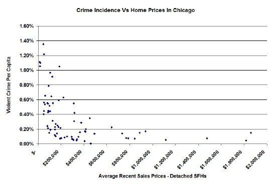
I plotted the results for each community area below in one of my characteristic scatter diagrams and, no surprise, areas with high crime tend to have cheaper homes. Of course we don’t know if the homes are cheaper because of the high crime or if the crime is high because of the poverty in the area, which is also reflected in the low home prices.
Notice that the data is rather asymptotic. Below $200K the crime incidence really starts to shoot way up and once you go above $600,000 the crime goes way down. “Good neighborhoods” seem to have a crime incidence below 0.2%.

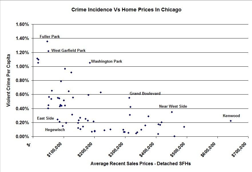
But also notice that at each price level there is quite a dispersion of crime rates and there are some real outliers on both the high side and low side. That’s what’s really interesting. I took a closer look at the data by zooming in between $0 – 600K in the graph below. Also, I made the graph clickable so that you can see a larger version of it and I’ve labeled a few of the outliers.

There are a few interesting situations in there. For instance, the Near West Side and Kenwood both experience higher crime than you would expect given their recent home sales. But both of those cases illustrate the problem with averaging data across even a smaller geographic area. Those areas are really a mix of blocks with higher home prices and much lower home prices – or even really low priced condos and higher priced detached single family homes. And the areas with the lower priced homes indeed have higher crime.
I’m making the underlying data available below, sorted by home prices so that you can pick out the outliers yourself.
#crime #ChicagoCrime #ChicagoRealEstate
If you want to keep up to date on the Chicago real estate market, get an insider’s view of the seamy underbelly of the real estate industry, or you just think I’m the next Kurt Vonnegut you can Subscribe to Getting Real by Email. Please be sure to verify your email address when you receive the verification notice.
