There is an updated version of this post with data through June 2019 here: Chicago’s Safest And Most Dangerous Neighborhoods 2019: Murders
It’s that time of year again when tempers and temperatures flare in unison, resulting in the untimely demise of hundreds of people. Everyone already knows that Chicago’s murder rate has skyrocketed in the last year or two so people want to know which are Chicago’s safest and most dangerous neighborhoods. I’m going to look at that a few different ways over the next few weeks starting with where people have been killed in the last 12 months.
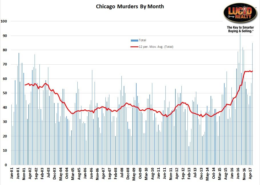
First, a bit of historic perspective on what has happened to the overall murder rate in Chicago. The graph below shows monthly murders back to January of 2001 and is current through the end of June 2017. It also has a 12 month moving average that reflects the overall trend in the murder rate and removes the obvious seasonal effect. As you can see from the graph the murder rate in the city declined for about 10 years but then started turning upwards in 2015, only recently flattening out. The current rate is the highest it’s been in 17 years. For the 12 months ending in June 2017 there were 784 homicides compared to 611 through June 2016. We can all look back fondly at the days when *only* 464 people were killed in Chicago through June 2015.
 Chicago Murder Rate By Neighborhood
So people obviously want to know how “safe” or “dangerous” various neighborhoods are and looking at where people have been killed is just one measure of that. In the graph below I calculate the number of murders per 100,000 residents in each of Chicago’s 77 officially defined community areas and then rank them from low to high. First, my usual caveat that in this particular case I’m referring to community areas as neighborhoods though normally I bristle at such a practice. I’m only doing it because people are looking for “neighborhood” crimes statistics and this is the closest thing to it. So, for example, you’ll find West Town on the list but not Ukrainian Village.
There are a few things worth noting about this analysis:
- Several community areas had no murders at all but I think it’s worth noting that Bridgeport and Portage Park had none.
- West Town climbed (got worse) in the rankings this year
- Hyde Park is not that much worse than Logan Square
- The Loop improved this year
- Englewood is not surprisingly the worst area. Caracas, Venezuela is still the world’s most dangerous city with 120 homicides per 100,000 residents but Englewood blows that away with 172.
Now, the graph below looks really tiny and unreadable initially but if you simply click on it once it will blow up and you’ll be able to scroll through it.
Map Of Chicago Murders
So I also mapped out each of the murders over the last 12 months below so that you can see when and where they took place. The map is interactive so you can pan and zoom, you can open a full page version of the map, you can share it, and you can click on each of the balloons to get more information on the homicide.
Once you zoom in and out and pan around a bit you can get a much better sense of where the safest and most dangerous neighborhoods are based upon murder rates. The community areas are rather large and the murder rate can vary greatly from one block to the next.
There are clear patterns of where the murders are concentrated – such as west of Western/ south of North Ave. and just West of The United Center and on the south side but not so much in Bridgeport, McKinley Park and Hyde Park.
#ChicagoCrime #ChicagoMurder #ChicagoHomicide
Gary Lucido is the President of Lucid Realty, the Chicago area’s full service discount real estate brokerage. If you want to keep up to date on the Chicago real estate market, get an insider’s view of the seamy underbelly of the real estate industry, or you just think he’s the next Kurt Vonnegut you can Subscribe to Getting Real by Email using the form below. Please be sure to verify your email address when you receive the verification notice.
