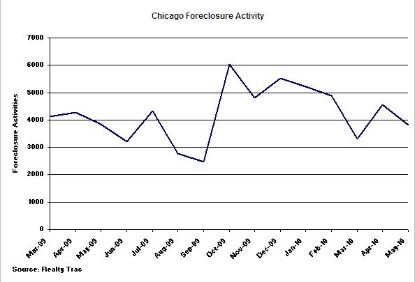
RealtyTrac recently released their May statistics on Chicago foreclosure activity and it shows a slight decline from April.

Though the mainstream media might make a big deal out of this 16% decline from the previous month, you can plainly tell from the graph above that there is a lot of variability in these numbers and the most recent change is just not significant.
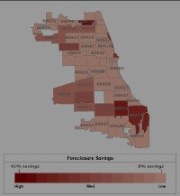
What is more interesting are some of the heat maps that RealtyTrac provides – e.g. foreclosure rate by zip code or foreclosure discounts (calculated from the peak value in the last 5 years). If you click on the image below you can see their foreclosure discount map. A few of those zip codes on the southeast side are discounted by about 50% from their peak values.

